Quickly Visualize Enterprise Data with the New Chart Plugin
Appery.io Charts plugin
From talking with developers who are building business and enterprise apps, we’ve heard that displaying data visually with charts is one of the highest priority requirements. To make it easy to visualize data, Appery.io has introduced a lightweight plugin that has everything you need to add pretty and inform-dense charts to your mobile app.
In this post we’ll show you how to do exactly that.
The Appery.io Charts plugin is available for AngularJS types of apps – both Ionic and Bootstrap. It’s built on the popular Chart.js library and consists of two JavaScript and one CSS asset. It can be added to your app the same as any other Appery.io plugin:
- Open your Appery.io app and go to
CREATE NEW > From plugin. - Choose
Appery.io Chartsand clickImport selected plugins. - All the assets and the
chartspage will be added to your app.
Now you can go to Project > Routing and set the Default route for charts page to make this the initial page for your app.
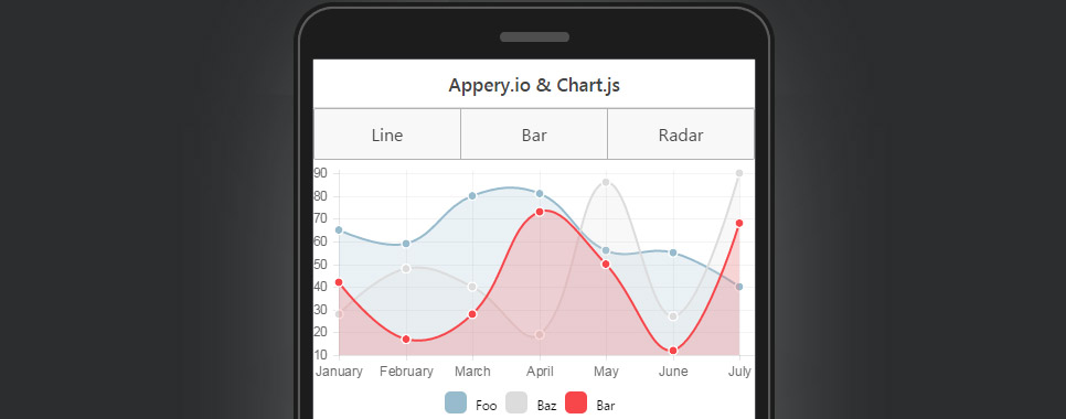
There are three type of charts implemented in this plugin – Line, Bar and Radar. Switch them and see the animation by clicking the appropriate buttons.
Chart.js supports many other chart types, you can learn about the other charts here.
In this plugin, charts are displayed based on the data stored locally, in the scope variable. However, you may want to use a database as the data source for your charts. It will take less than a minute to configure the plugin in this way. Read the plugin documentation to see how.
Hopefully you will find this easy-to-use plugin useful. If you have any suggestions on how to make it better – feel free to contact us!