Building Responsive Mobile Apps with PhoneGap, AngularJS and Bootstrap
Are you developing with responsive design in mind?
Responsive mobile apps are the new standard, but building them without understanding the proper tools can be daunting. To ensure you are up to the challenge, take a look at the following tools. Especially when used in conjunction with the new Appery.io Visual Builder, these tools can help you create some fantastically responsive mobile apps.
Bootstrap
Twitter’s Bootstrap is the reigning king of responsive UI frameworks – you can easily go from desktop to tablet to smartphone, since Bootstrap adapts to the change in platforms and their screen sizes quickly and efficiently.
Since version 3.0, Bootstrap has maintained a mobile first design philosophy, emphasizing responsive design by default. It contains HTML- and CSS-based design templates for typography, forms, buttons, navigation and other interface components, as well as optional JavaScript extensions.
In addition to the regular HTML elements, Bootstrap contains other commonly used interface elements and advanced typographic capabilities. The elements include buttons with advanced features — including the grouping of buttons or buttons with a drop-down option, navigation lists, horizontal and vertical tabs, and labels. The components are implemented as CSS classes that must be applied to particular HTML elements in a page.
AngularJS
AngularJS is an extremely popular web app framework designed to combat the challenges encountered in developing single-page applications. Its goal is to simplify both the development and testing of single-page applications by providing a framework for a client-side model–view–controller (MVC) architecture.
In general, HTML is great for declaring static documents, but has issues when you try and use it for for declaring dynamic views in web applications. AngularJS extends the HTML vocabulary for your application, creating an environment that is expressive, readable, and enabled for efficient development.
In terms of building responsive and dynamic apps, AngularJS is a fantastic tool for multiple reasons including it’s two-way data binding: AngularJS allows you to automatically update the view whenever the model changes, and, vice versa, you can update the model whenever the view changes. This means you can remove DOM manipulation from your list of things to deal with, making responsive development faster and easier.
PhoneGap
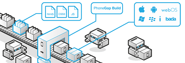
Apache Cordova, often referred to as PhoneGap, works by using a common set of APIs across platforms, allowing you to deploy your app to all of your target platforms from a single code base. This means that instead of using platform-specific APIs for iOS, Windows Phone, and Android, you can simply use PhoneGap to wrap the same HTML, CSS, and JavaScript code in a way specifically tailored for each device type.
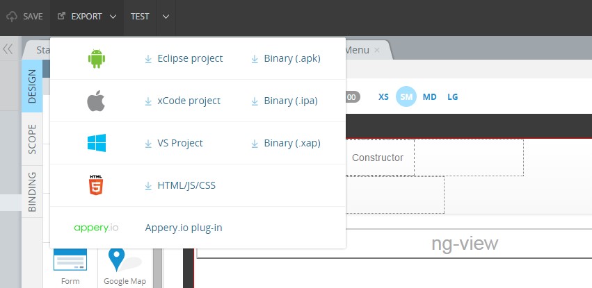
Because your apps are made of HTML, CSS, and JavaScript, your app can use the AngularJS and Bootstrap libraries. By using PhoneGap, you can instantly export your app as a binary for multiple platforms from your single code base, making developing responsive and dynamic apps faster and easier than ever.
In the App Builder
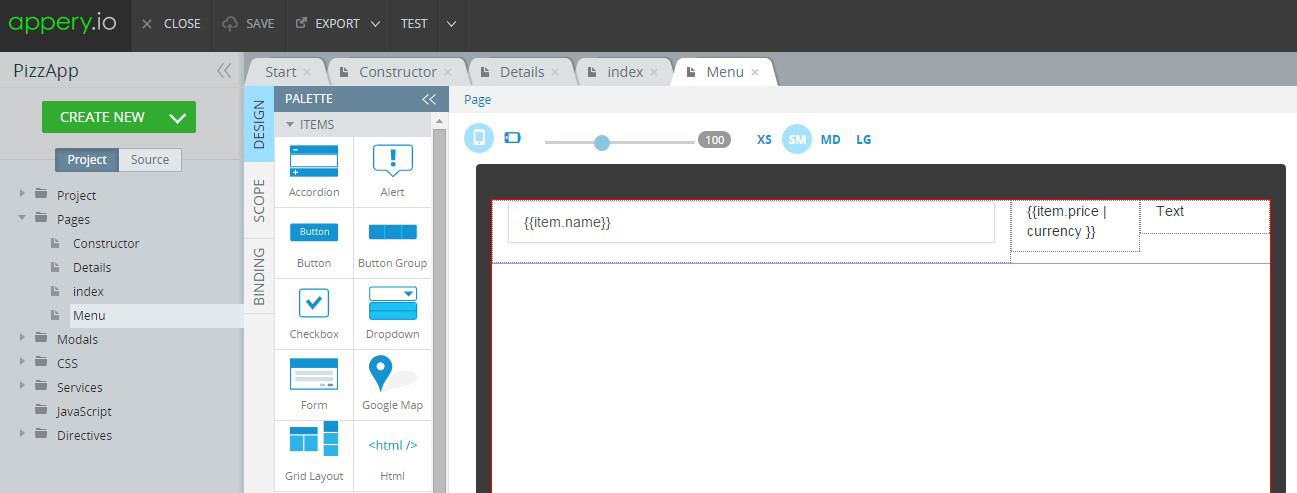
The Appery.io Builder has supported PhoneGap capability for a long time, and recently we’ve updated the Appery.io Builder to also include AngularJS and Bootstrap support. With the new AngularJS and Bootstrap Visual Editor, you can use Bootstrap’s responsive utilities, such as the grid system, for showing and hiding content depending on screen size. Also, you can easily use UI components like drop-downs, button groups, and alerts.
For AngularJS, the new Visual Builder allows you to use almost all the benefits of the framework, including data binding, controllers, directives, filters, and responsive UI components such as AngularJS Google Maps. And, of course, in the Appery.io App Builder, each new app includes PhoneGap. This means you can use any of the JavaScript APIs provided by PhoneGap, as well as accessing native device features such as camera and contacts. Then you can export your app for multiple platforms.
You can try build responsive apps with the new Appery.io Visual Builder by going through these tutorials.
Happy responsive coding!


