New Mobile Components: Datepicker and Carousel
In our April release we introduced two new mobile components: Datepicker and Carousel.
Datepicker
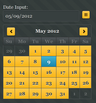
Datepicker has been requested by our users and allows to select date from a calendar popup. This is how the component looks when displayed on the page (not activated)

and this is how it looks when activated:

The component comes with a number of useful options such as setting the earliest and latest date you can select. This is great for validation. Setting the Sunday or Monday as start day of the week as well as being able to edit months and days labels.
Note that Datepicker is a plug-in and not yet an official component in the jQuery Mobile library.
Carousel
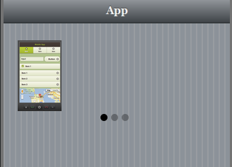
Carousel consists of one or more panels which can be switched with a swipe (left or right).

The three dots indicate the number of items in the carousel. This component is best tested on the actual mobile device. Also note that only Webkit-based browsers support this component (Android and iOS).
Both components are available in any project (old or new) in the Mobile UI palette.
