10 Features You Need When Creating Interactive HTML Prototypes [In Pictures]
From JavaLobby: 10 Features You Need When Creating Interactive HTML Prototypes

From JavaLobby: 10 Features You Need When Creating Interactive HTML Prototypes
Another Appery.io review: English version [original Russian version]
Today we released Appery.io version 1.2.6 with numerous features and enhancements. Behind the scenes, we made the editor more stable and faster. We think you will really like what we have in this release.
New link and spacer mobile controls to make it simpler to build mobile prototypes:
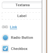 |
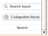 |
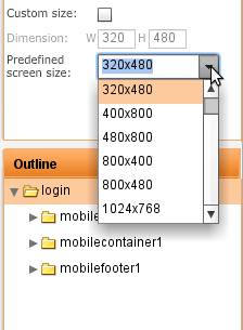
Mobile preview now shows the prototype within the actual screen size you defined in properties:
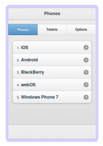
Select a predefined size or set a custom one:
Tabs layout container got even more flexible. In addition to positioning the tabs at the top or bottom, you can also now position tabs on left or right:
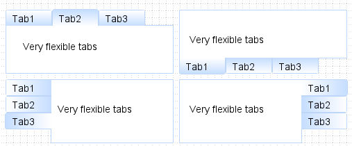
It was possible to navigate between pages using a link, button or an image but somehow we missed the menu. Well, it’s now possible to navigate via menu as well. Drag and drop a menu into a page and head to properties to set navigation:

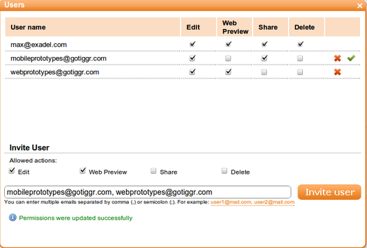
If you shared a project before, the user you shared with had full access to the project, he or she could edit, delete, preview and invite others to share. Starting with this release, you can control what permissions each user has. And, you can invite multiple users at once, just separate emails with a comma or semicolon.
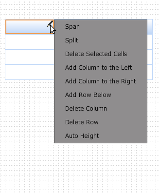
When you insert a new component, the component is inserted in edit mode automatically, so it’s easier to edit (no longer need to double click to enter edit mode):

Let’s just say editing a grid or table row/column wasn’t the simplest task to do. Luckily, we made it much simpler. Just click the edit icon (pencil) in a column and select your action. That’s it. You can also edit rows/columns in properties.
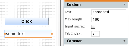
When viewing a prototype in a Web browser, it’s important to be able to test how tabbing works on input components. When creating a prototype, it’s now possible to set a tab index for input components:
Creating a radio button group was some what tricky (had to place the buttons inside a container). You don’t have to do it any more. A new property allows you to include any number of radio buttons in a separate group:

We hope you will never do, but if you really really have to, you can now delete your Appery.io account by going to My Account (just in case, you will have 2 weeks to reactivate it). [User requested].
As always, let us know what you think and what features you would like to see: http://getsatisfaction.com/apperyio. Don’t forget to follow Appery.io on Twitter (@apperyio).
TheServerSide.com: Why You Need Interactive and Clickable UI Prototypes for Your Next Project
We moved Appery.io support to a new address, at http://getsatisfaction.com/apperyio. But don’t worry, we have moved all the community topics there as well. So, let us know what you want to see, what we can do better or answer any questions.
The Appery.io team.
Appery.io in the field of prototyping (English version).
Original Russian version.
Layout is crucial in any design. Luckily, Appery.io provides 6 different and customisable layout containers to help you that. All the available layout controls are available via Containers palette:
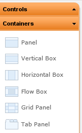
The first one is Panel:
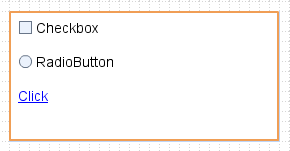
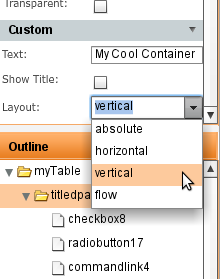
Panel is more or less a general-purpose container where the layout is set to vertical by default. You can change the layout flow in properties:
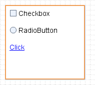
Next is Vertical Box in which the layout is set to vertical by default:
Horizontal Box sets layout flow to horizontal:

Flow Box sets layout flow to flow:
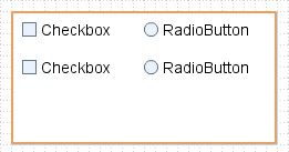
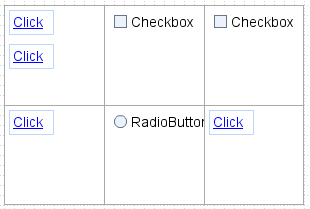
Grid Panel divides a panel into equal size squares inside which you can place other controls:
One more is the Tab Panel:
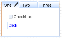
It’s possible to create (and edit) any number of tabs and place any controls inside them: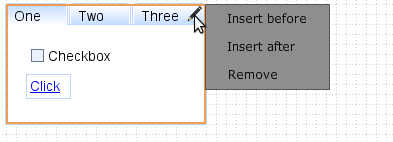
Enjoy layouts!
Appery.io prototypes are interactive. For example, when you place a tab panel and then view the prototype in a web browser, you can switch between the tabs. We recently made the Appery.io prototypes even more interactive. It’s now possible to navigate between pages (screens). When you use a button, link, or an image you get an option to specify to which page to transition. When running in Web Preview, you will simply navigate to a different page, just like in real application. Well, making it as real as possible is the whole idea behind Appery.io.
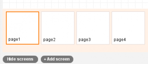
Let’s see an example of a multi-screen wizard. First, there are four pages:
This is the first page:
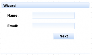
View other pages in prototype in web browser.
If we select the button and look at its properties, we get this:
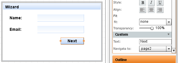
Once a button is selected, you will see Navigate to option in properties. There it’s possible to select any of the available screens. When viewing the prototype in a web browser, clicking this button will navigate to page 2.
Other controls which support navigation are link and image.
You probably want to see how this works? Just click here to view the prototype in web browser. In addition to links, you can also switch between pages by using the drop down menu at the top of the page.
Our goal is to make the prototype as real as possible.
A few weeks ago we launched a new address for Appery.io: https://appery.io. Today we are also launching a new blog https://blog.appery.io. This blog will cover Appery.io, web and mobile application prototyping, design and everything related. It will also cover new features, tips and articles. Come back often.
Some latest features in Appery.io: