Development Tip: Using The Bootstrap Grid In Appery.io
Popular Bootstrap Grid is available in Appery.io’s Bootstrap project as an UI component that can be dragged and dropped to the page. The following steps show how to change grid cell sizes for different screen resolutions:
- First open the AngularJS / Bootstrap project and place the
Gridcomponent to the page. - Now, if you will look at top right corner of the grid you’ll see a green plus button, this button will add a new row to your grid. If you don’t need to add a new row, but want to add new cells to existing row click on one of the grid cells and then choose
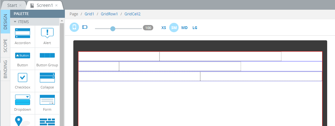
GridRowthrough the breadcrumbs:

- A green “+” sign now will add a new cell to an existing row.
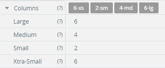
- You can configure the size for each cell for the four screen sizes. Click on the grid cell and the expand
Columnsproperties in thePROPERTIESto the right of the screen. Type a number from1to12to define how it will look on the screen:

Don’t forget that you can emulate page size directly inside the editor, and when testing the app in browser by clicking XS, SM, MD and LG buttons.
Make sure to check out all of our mobile development tips.
Do you want to build apps fast? Start developing with our trial plan!

